A portfolio that steps back so the paintings can speak.
We designed and built sarabaruh.com for Sara Baruh, an Istanbul-born abstract painter working in Geneva: a bilingual archive of her works on canvas and paper, her exhibition record and her catalogues, made for the collectors, galleries and curators who look her up.
Sara Baruh has shown in Geneva and Istanbul for almost three decades, with a new solo exhibition at Bozlu Art. She needed one place that holds the whole body of work, reads well in both her languages, and gives a gallery or collector everything they need before they write.
Client : Sara Baruh, contemporary artist
Practice : Abstract painting in oil, acrylic and ink, on canvas and handmade paper
Based : Geneva, exhibiting in Istanbul with Bozlu Art
Platform : WordPress, Elementor Pro, WooCommerce as the catalogue
For an artist, the website is the portfolio a gallery checks before it replies.
Curators, gallerists and collectors look an artist up before a studio visit, a fair or a purchase. They want three things: the work shown at its best, the record behind it, and an easy way to get in touch. Most artist sites miss one of them. The design fights the images, the CV is a PDF, or the contact details are hard to find.
/ The problem
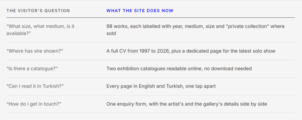
Three kinds of visitor arrive, each with a different question. An image grid answers none of them well.
Collector
“What size is it, what is it made with, and is it still available?”
Gallery or curator
“Where has she shown, with whom, and is there a catalogue?”
Istanbul audience
“Can I read all of this in Turkish?”
/ Insight and strategy
Design it like a gallery wall: white space, one work at a time, and every label a collector would ask for.
01
Let the work lead
A white ground, one quiet typeface and no decoration, so colour and texture come only from the paintings.
02
A catalogue, not just a gallery
Every work is a record with title, year, medium, size and status, so the site works as an archive as well as a showcase.
03
Two cities, one archive
English and Turkish versions of every page, because her audience is split between Geneva and Istanbul.
/ What we built
Five systems, each built around one of those questions.
/ System 1
The artwork catalogue
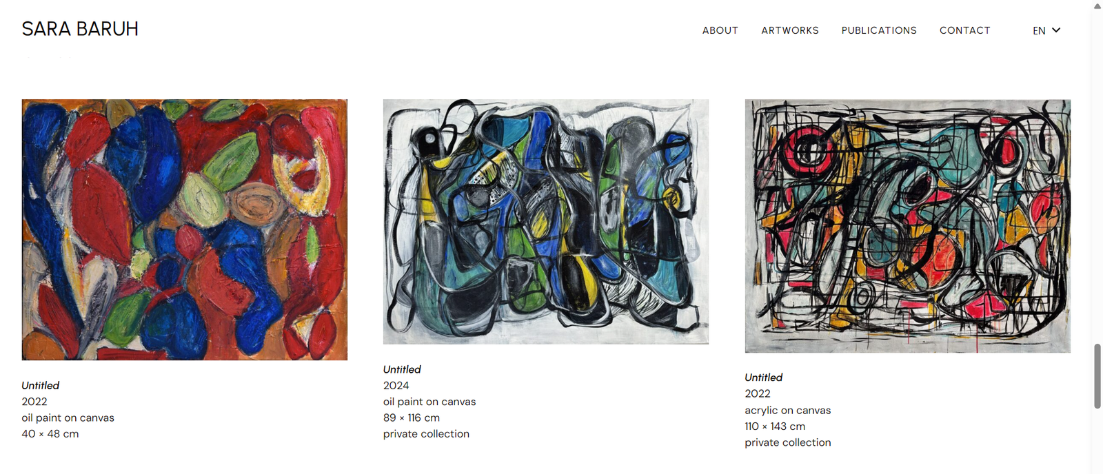
We used WooCommerce as a structured catalogue rather than a shop. That gives 98 works real data, filtering and paging, with none of the shop clutter on screen.
Two collections, On Canvas (72) and On Paper (26), in the main menu
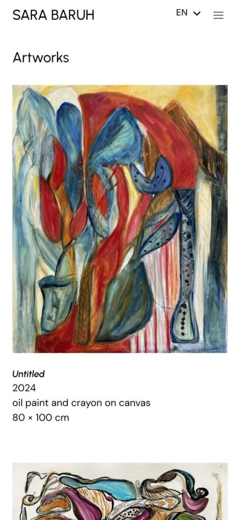
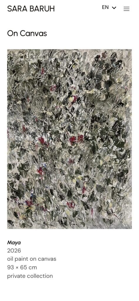
Each card carries the museum label: title, year, medium, size
Works already sold are marked "private collection"
Load More keeps the grid calm instead of one endless page
/ System 2
One page per work
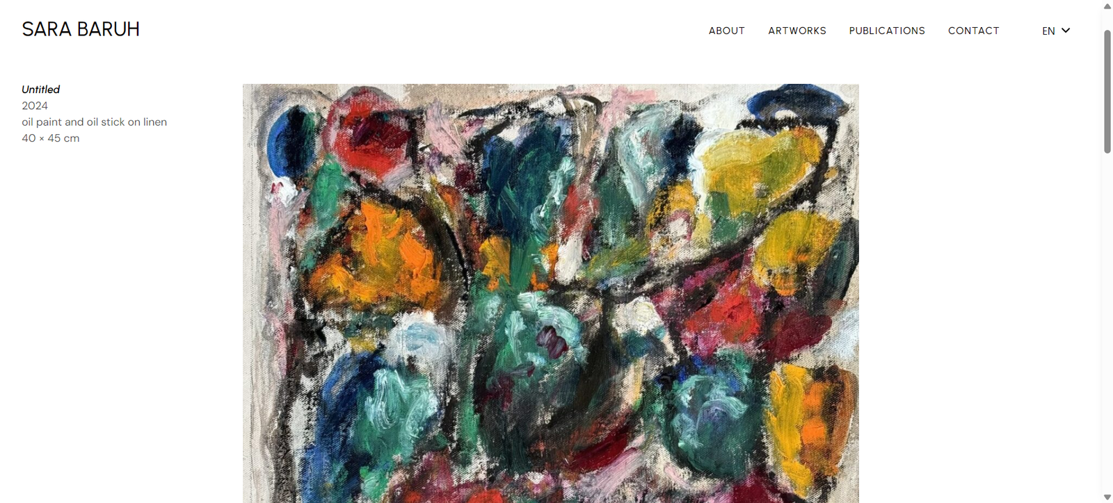
Each painting gets the treatment it would get on a wall: shown large, with a short label set apart, the way a gallery hangs it.
Large single image with the label beside it
"Other Artworks" below, so a visitor keeps looking
Every work has its own link to share with a collector
/ System 3
Exhibitions as stories
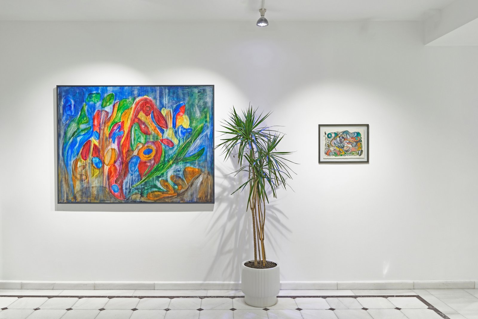
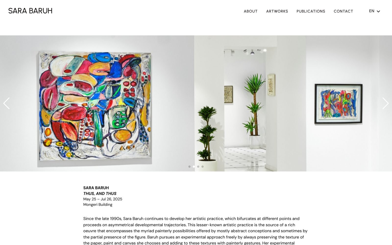
A show deserves more than a line in a CV. The exhibition page carries the installation views and the full curatorial text for “Thus, and Thus”.
Installation photo slider from the Mongeri Building, Istanbul
Dates, venue and curatorial essay on one page
Linked from the homepage hero and the About page
/ System 4
The record, in full
The proof a curator looks for, on the site itself rather than in an attachment.
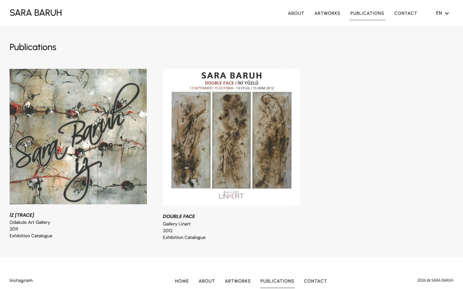
Structured CV: education, 17 solo shows, 11 group shows, 11 fairs
Past exhibition catalogues you can page through in the browser
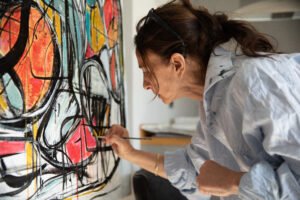
Biography in both languages beside a studio portrait
/ System 5
Two languages and a clear way in
The whole site switches between English and Turkish from the header, and every enquiry has an obvious place to go.
EN / TR switch on every page, with proper language tags for search
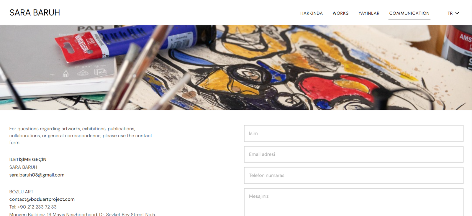
Contact form for artwork, exhibition and collaboration enquiries
Both the artist's and the gallery's contact details shown
Newsletter opt-in built into the form
/ Built for the phone first
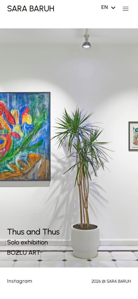
Collectors often find an artist from Instagram, on a phone. The work holds up at that size too.
Homepage: the current show first
Catalogue: one work per row, label below
Artwork page: the image at full width
/ The result
Thirty years of work in one place, ready for whoever asks next.
Works online
98, in two collections
Exhibition record
17 solo, 11 group, 11 fairs
Catalogues
2, readable in the browser
Found by search
Sitemaps for works, shows and catalogues
“Pixel Prompt gave my work the quiet, considered space it needed. The paintings speak first, in English and Turkish.”
WordPress · Elementor Pro · WooCommerce and ShopEngine · TranslatePress · dFlip catalogues · MetForm · Rank Math · Google Site Kit
/ Your product is curated
Is your store?
If customers love your products but the store doesn’t guide them to buy, that’s what we fix. Start with a fixed-price Store Conversion Audit, delivered in five days.